Favorite Paint Mixtures: Cerulean Blue
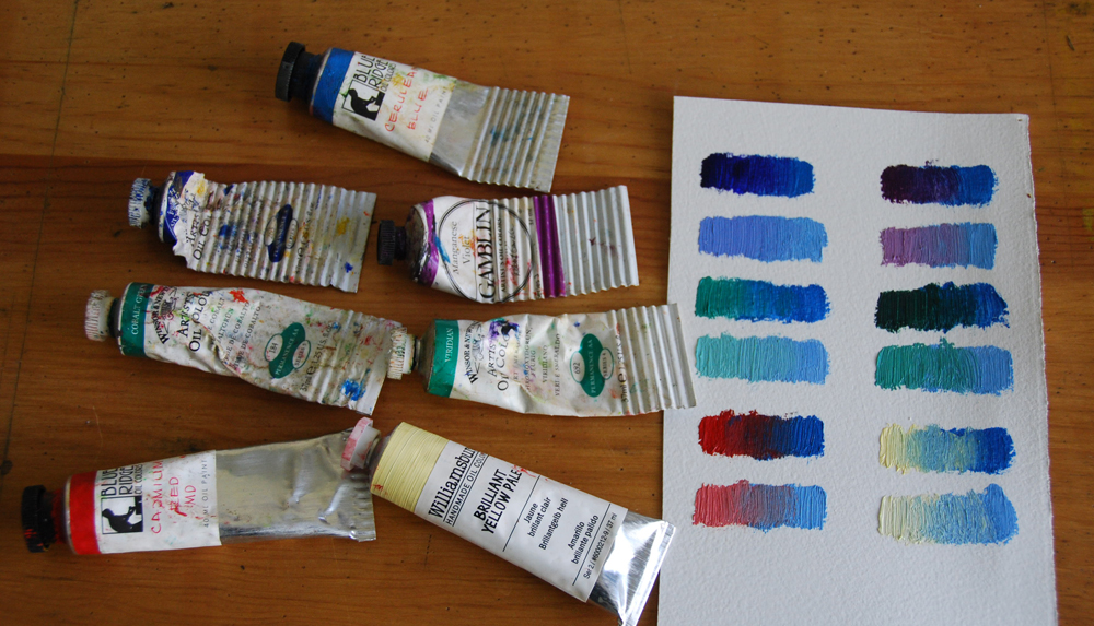
cerulean-favorite-paint-mixtures-with-tubes
When I first began taking painting classes taught by Danni Dawson, I remember her saying what a helpful paint cerulean blue was. I remember this because I remember thinking at the time, “what does she see in it?”, because I had a tube of it and hardly ever used the color when I would squeeze some out.
Instead the squeezed out paint was more destined to dry out untouched on my palette than ever be touched by a paint brush.
At the time, I favored cobalt turquoise more whenever I would need a blue-green. I still love using cobalt turquoise, however in this past year I have grown to love the soft, semi-opaque quality of cerulean blue.

cerulean-favorite-paint-mixtures-clouds-1
Cerulean blue because it is a softer blue can be mixed to create some wonderful atmospheric effects. And in skies I think it is a color that really excels when you want to recreate the subtle blues that fade to greenish-blues as the sky moves closer to the horizon.
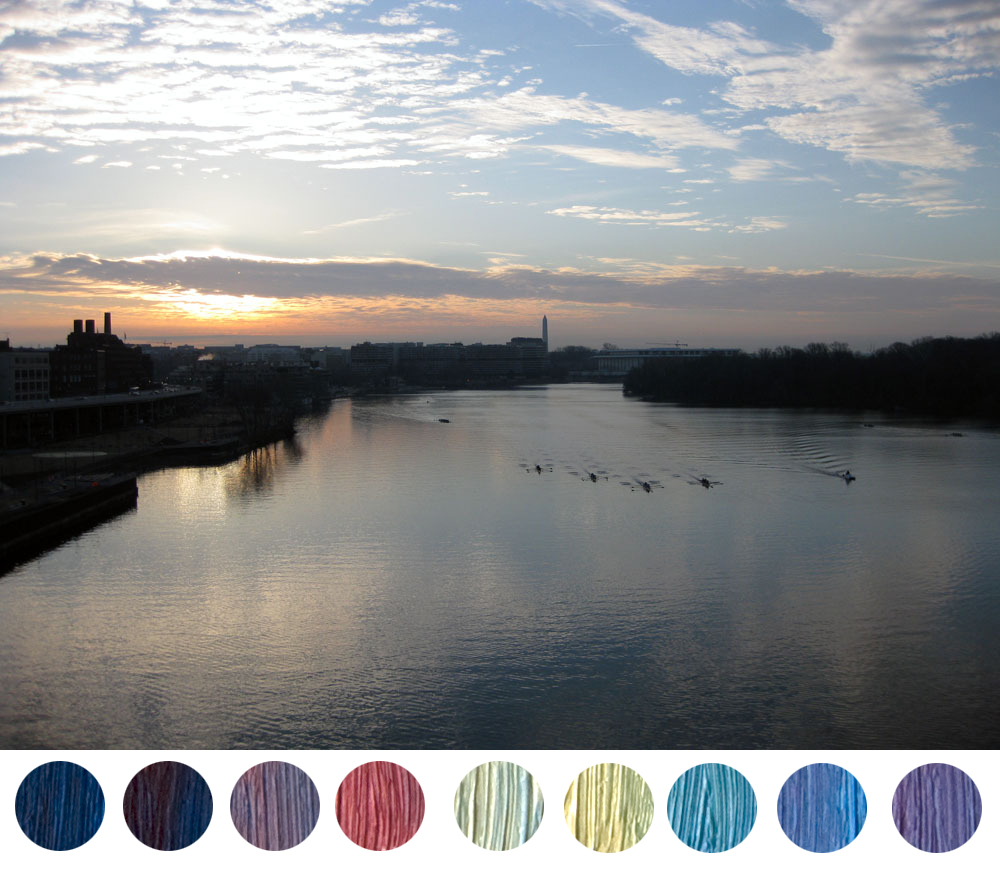
cerulean-favorite-paint-mixtures-clouds-2
Cerulean also mixes so well with its neighbors on the color wheel, that if a blue needs to be deepened or shifted ever so slightly, it is almost always better to try it first with cerulean rather than the more opaque cobalt turquoise

cerulean-with-swatches
Cerulean Blue (PG 35) is a semi-opaque, granular pigment, that is soft and subtle, and mixes so well with its neighboring colors on the color wheel. What I have grown to love about this pigment is how it shifts and slides from being a rich greenish-blue in it pure state to soft mixtures of blues, purples, or greens.
This is a color that requires a bit of finesse in using it because it is a granular pigment. Just play around with a true cerulean blue in watercolors to really see how granular it is when laying down washes, however it is this quality that also lends it its velvety texture in oil paint, something to be cherished and used to its maximum effect.
In the past year I have switched from using the Winsor & Newton Cerulean Blue to the Blue Ridge Cerulean Blue, which are both semi-opaque paints, however I prefer how the Blue Ridge is more creamy and soft. Also to note, the Williamsburg Oil Colors Cerulean Blue is an opaque pigment as it comes out of the tube and to achieve the quality I have grown to like so much, you need to mix it with some medium like stand oil to get the semi-opaque quality.
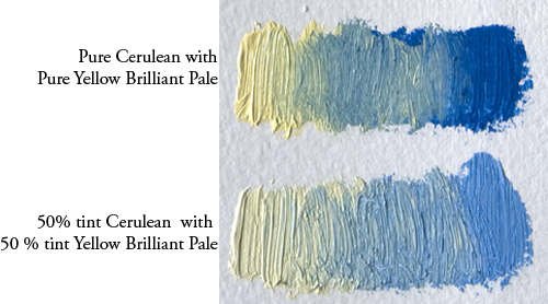
cerulean-yellow-brilliant-pale

cerulean-viridian
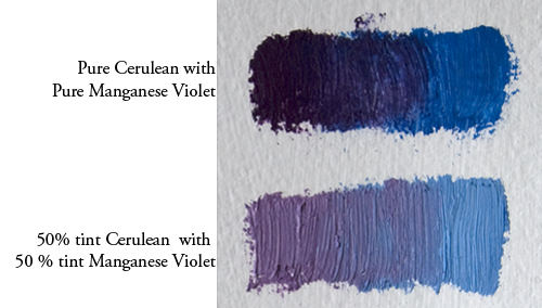
cerulean-manganese-violet
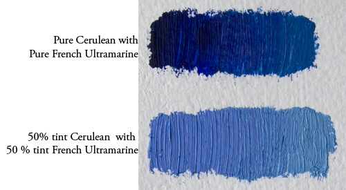
cerulean-french-ultramarine

cerulean-cobalt-green
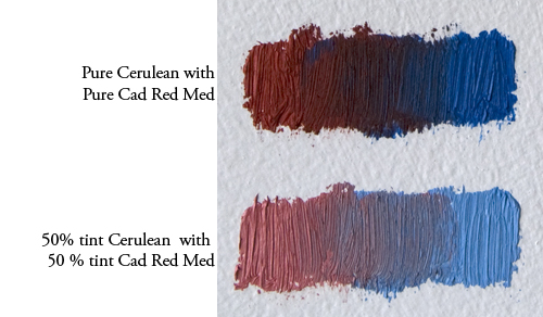
cerulean-cad-red-med
Want to learn more about painting with oils?
Sign up for the free e-book
“Getting Started with oil Paint”

In this 20+ page downloadable PDF you will learn:
3 keys to start oil painting
some favorite painting supplies

Click Submit! below
and get instantly the downloadable guide “Getting Started with Oil Painting”