These are my favorite paints!
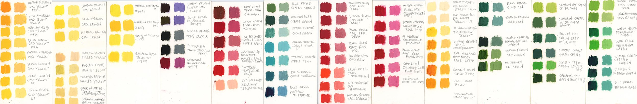
You may wonder why I have so many colors on my palette and why I do not use a limited color palette. This is because I have chosen to paint with oils in the colorist tradition of striving to capture the visual impression of color and light, versus focusing mostly on depicting form and letting color play a minor role in my artistic expression. By using the colorist methodology of painting, I have found that I need the most saturated version of the colors available, I then have the option to desaturate my mixtures as the situation in the painting warrants.Most of the oil colors on my palette are pure pigments and only a few choices are convenience mixtures, and I specifically choose them after some deliberation.
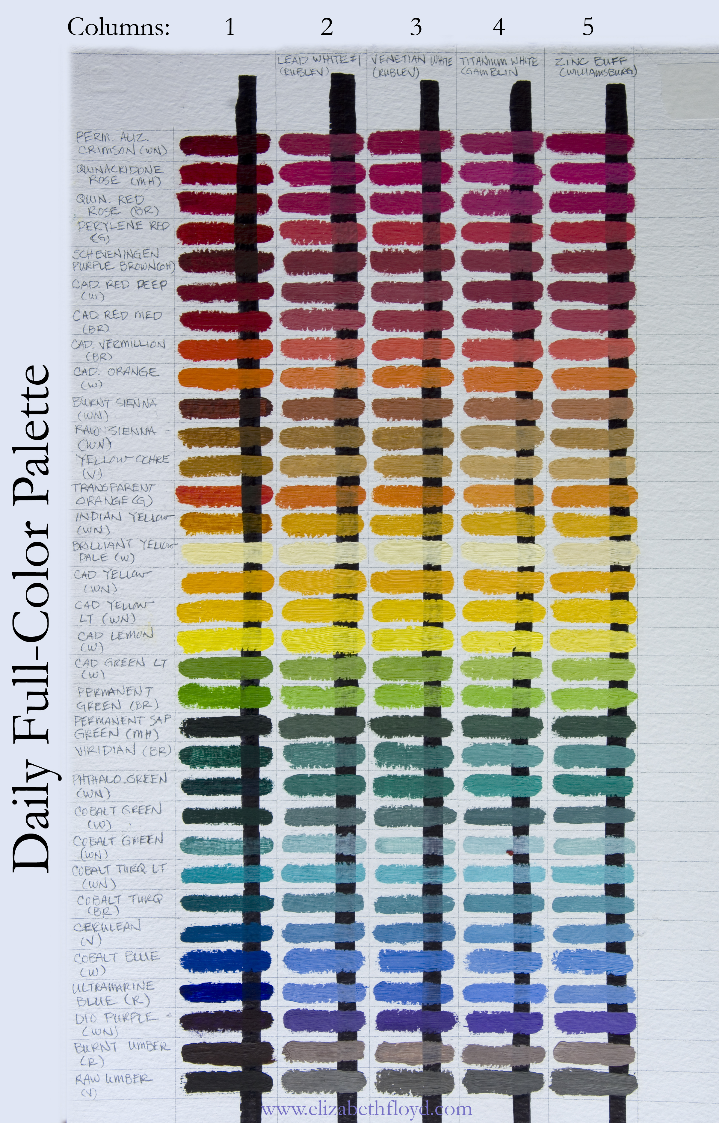
Let me share a bit about my painting process. I use layers of color tints (one or two colors mixed with white) to build up the three-dimensional illusion of space, mass, and value in my paintings. Often I start with pure, intensely saturated color tints, and then refine and desaturate these initial layers of color as the painting evolves by laying additional layers of paint on top of previous layers. I look for color compliments and ways to enhance the visual impression of color and light in my paintings, however I also strive to always maintain a strong feeling of form in my work. This means that modeling and getting the values accurate is equally important to me as it is for accurately capturing the color passages in my paintings.
Because when you’re painting you are using a physical thing, pigment suspended in linseed oil or another medium, some colors do not mix like they are expected to if you follow the rules of color theory and because of that some pigments/oil colors are better than others when working and interacting with other oil colors.

As part of my studio practice I believe in exploration and experimenting with my results and testing what different oil colors interact with others. In this past year I have decided to go back, really investigate the oil colors I use on a regular basis. In the beginning of this investigation, I just painted out a pure from the tube swatch next to a 50/50 mixture of the paint with white and labeled them. Quickly I realized this was not providing me with enough information that I was seeking, so I began to make graduated scaled swatches of each color.
These upcoming articles are my way of organizing and listing out all of the relevant information I know about them. All information is derived from my own experience. I will also share tips and opinions about why certain pigments have a constant place on my daily palette. I will be comparing paints from different manufacturers and I’ll explain which one I prefer and why.
So let’s start with a list of the colors I keep on my palette all the time.
This is my daily full-color palette set up. The first column of color swatches are the oil colors straight from the tube. For the next columns (two through five) I mix different whites I use on a regular basis with each color. In each of these columns, for each of the color tints, I tried to mix consistent volumes of white with pigment. This way it would be easier to discern the pigment density of each color and the tinting strength of the whites. The second column of color swatches are made with a mixture of Rublev’s Lead White#1. The third column uses Rublev’s Venetian White. The fourth column uses Gamblin’s Titanium White, and the fifth column uses Williamsburg’s Zinc Buff White (which as of May 2019 has unfortunately become unavailable, I have yet to find a good substitute). Eventually I will have an article that is just dedicated to the different whites I use, these four whites are just a few of what I explore and work with.
I know that there are many colors out there, however for this project, the oil colors I personally use and have explored are going to be written about. It is my goal with this project to share with others what I have learned from the different oil colors out there, hopefully you learn something as well and make better and more specific decisions about the oil colors you choose for yourself.
READ MORE ABOUT THE DIFFERENT PIGMENTS HERE:
Want to learn more about painting with oils?
Sign up for the free e-book
“Getting Started with oil Paint”

In this 20+ page downloadable PDF you will learn:
3 keys to start oil painting
some favorite painting supplies

Click Submit! below
and get instantly the downloadable guide “Getting Started with Oil Painting”