Mastering Color: Hue, Temperature, Value & Saturation for Painters
The Basic Characteristics of Color
Hey, fellow painters and color lovers! I will share the highlights of what I consider are, "The Basic Characteristics of Color". I teach this in my painting membership in order to help you learn all about color mixing. These slides are packed with insights that have transformed my approach to painting, and I can’t wait to guide you through hue, temperature, value, and saturation with a personal touch. Let’s explore these concepts together, using the visuals from my slides to inspire your next masterpiece!
What is Hue?
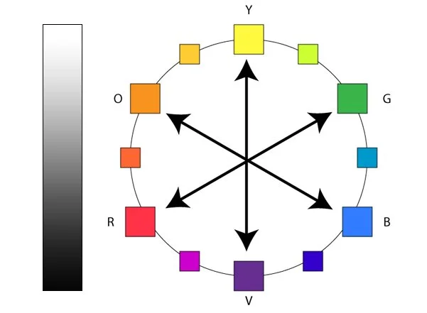
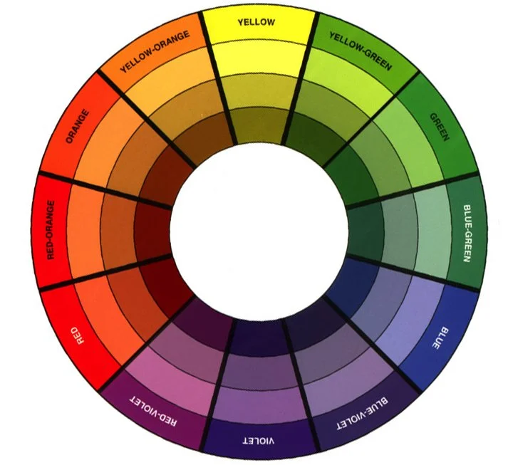
When I name a color—say, red, blue, or green—I’m talking about its hue, its spot on the endless color spectrum where every shade has its own unique wavelength. It’s a beautiful continuum that fuels my creativity!
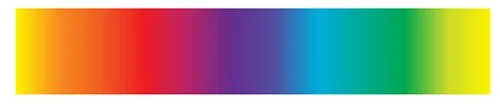
In my classes, I lean toward "color" or "local color" over "hue" to keep things clear. Paint companies sometimes confuse things by labeling non-pure pigment paints with "hue"—like "viridian hue" that’s really phthalo green (PG7) instead of true viridian (PG18). Every color I work with has three adjustable properties: value, temperature, and saturation, which let me tweak its look just the way I want.
Color Temperature: Warm vs. Cool

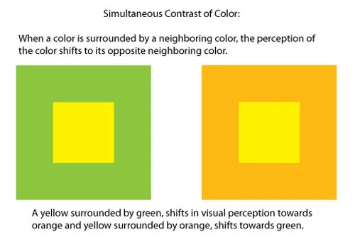
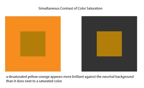
I love describing colors with temperature because it adds emotion to my mixes. Warm reds, oranges, and yellows feel lively and close, while cool blues and greens bring a peaceful distance. But here’s the fun part: a color’s temperature shifts depending on what’s around it, thanks to simultaneous contrast.
Value: Light and Dark
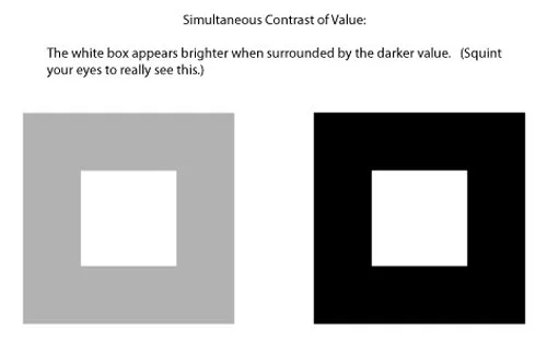
Value is all about how light or dark a color seems, and just like the spectrum, nature offers infinite gradations from bright white to deep black. It’s key for adding depth to my paintings.
Saturation: Purity and Intensity
Color saturation is how you catagorize the color’s purity—how vivid or muted it is. I sometimes call it intensity or brilliance, and Albert Munsell used "chroma" (highchroma for bold and low or achromatic for gray). I prefer "saturation" because it feels like a clear observation, not just an opinion.
Practical Examples: Mixing Colors with Pigments
I bring these ideas to life in my membership with hands-on demos. This color mixing lesson and demo is from February 2024
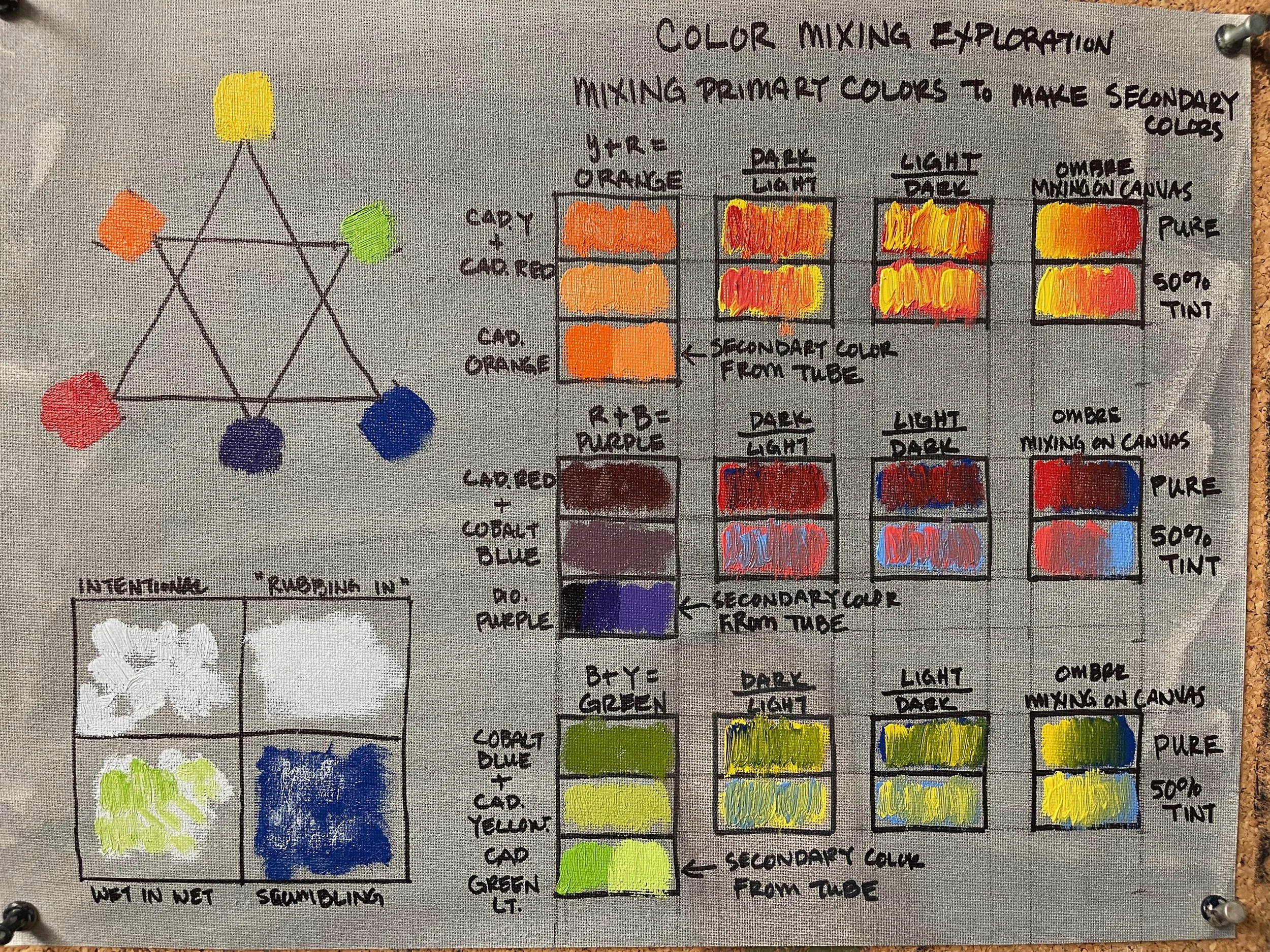
This is a favorite exercise of exploring color mixing and comparing the difference between mixing on the canvas using the visual effect of broken color or mixing the two pigments on the palette and then applying them to the canvas. This exercise is fully demonstrated in the February 2024 skill building session.
Mixing the right color with oil paint
Color is your most powerful tool when painting. When you are mixing colors you ask yourself these questions to narrow down and get to the correct oil paint color mixture.
What color is closest to the color of the object I am seeing?
What is the color temperature, is it warm or cool?
What is the value of the color, is it dark or is it lighter than my paint mixture?
And how saturated is the color and is my paint mixture close to what I am seeing?
If you are intrested in learning more about my membership, please feel free to send me an email.