For an SEO-optimized excerpt of your blog post based on the provided images and slideshow content, here's a concise and keyword-rich summary designed to attract search engine traffic while engaging readers. This excerpt focuses on key phrases like "finding your artistic voice," "artistic expression," and "develop your art style" to improve discoverability.
Discover Your Artistic Voice: A Guide to Authentic Art Creation
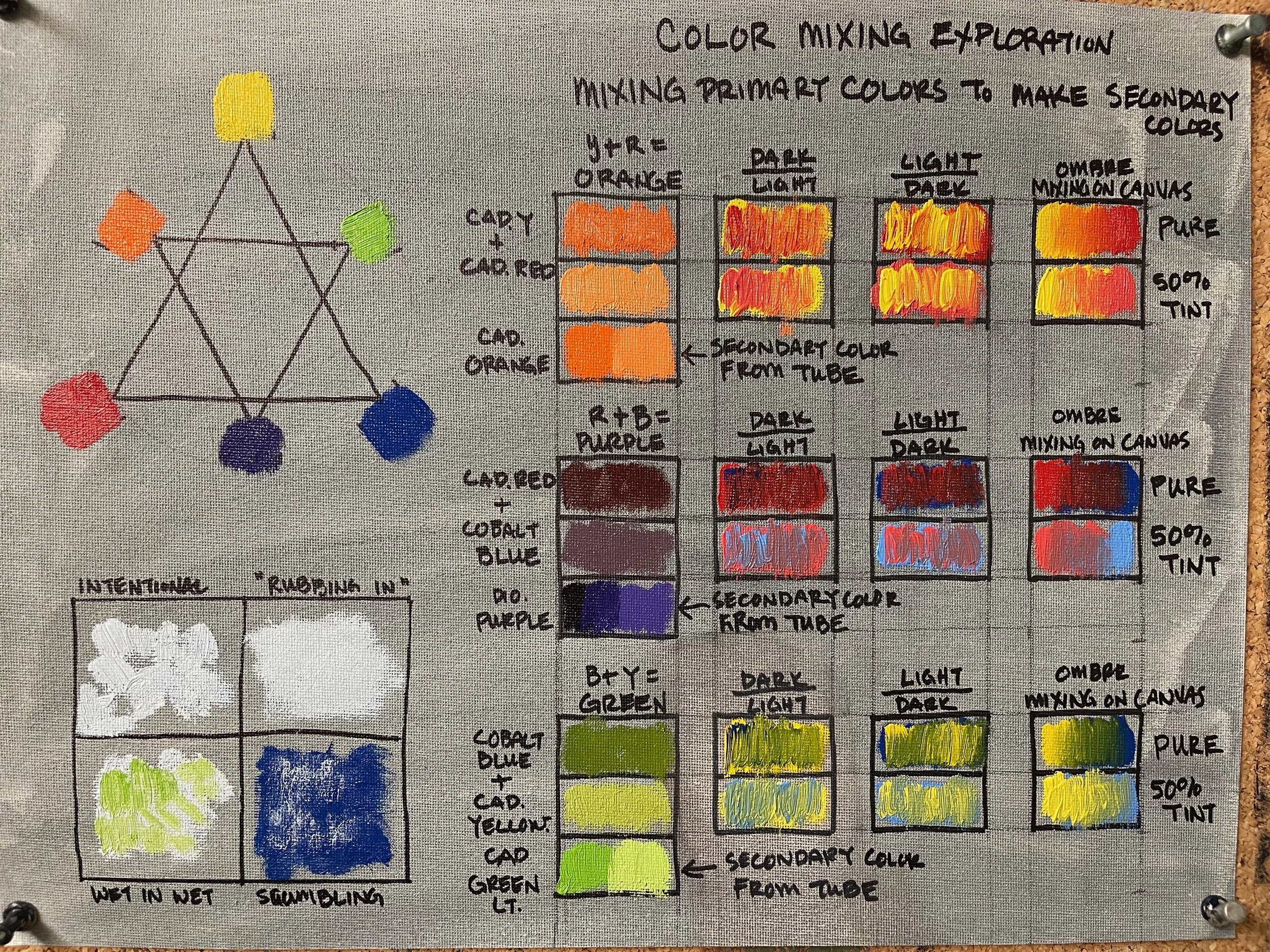
As artists, we have the unique opportunity to shape the world with our own influence—our artistic voice. This voice is a powerful blend of narrative, style, and technique, evolving as you grow. In my December 2023 painting membership class, I explored how to find and nurture this voice. Whether you're a beginner or seasoned creator, understanding what drives your art is key. Ask yourself: Why do you create? What emotions do you want to share? Your artistic voice emerges from knowing your story, refining your style, and mastering your technique. Start your journey today by reflecting on these elements—your authentic expression awaits!
Read More